Dementia Friendly Ward
Creating a sense of space with a colourful place: reducing disorientation and agitation for people with dementia
Overview
Project duration: 1 week sprint (Design Week 2018). Implemented over the following year
Partners: Mater Hospital Care of the Older Person Ward (St Anne’s Ward)
Funding: Mater foundation
Impact
Up to 25% of patients in hospitals are living with dementia.
The redesigned Care of the Older Person ward at the Mater Hospital better meets the needs of these patients by providing a more familiar-feeling and comforting environment that enables and supports them, with consideration given to their specific cognitive needs.
"Carers tell us time and time again that when it comes to hospitals, care homes or other settings, it's often the small things – whether clear signage, light and airy rooms or good handrails – that make a big difference."US Secretary of State for Health, October 2012
Challenge
Going into hospital can be a frightening and negative experience for anyone. For someone with dementia, this is further exacerbated by the unfamiliarity and frenetic nature of the surroundings as they battle to orientate themselves and process their environment. These difficulties can lead to increased agitation, disorientation and distress. How might we meet the needs of these patients by providing a more familiar-feeling and comforting environment that enables and supports them?
Process
Through a one week design sprint with hospital staff, 4 NCAD Masters students were able to identify and implement impactful changes to the experience for patients with dementia. This included changes to the physical spaces to reduce distraction and create a sense of comfort, as well as thoughtful use of light and colour to help with spatial recognition and feelings of safety.
Output
Simple, feasible and high impact adaptations to the ward including:
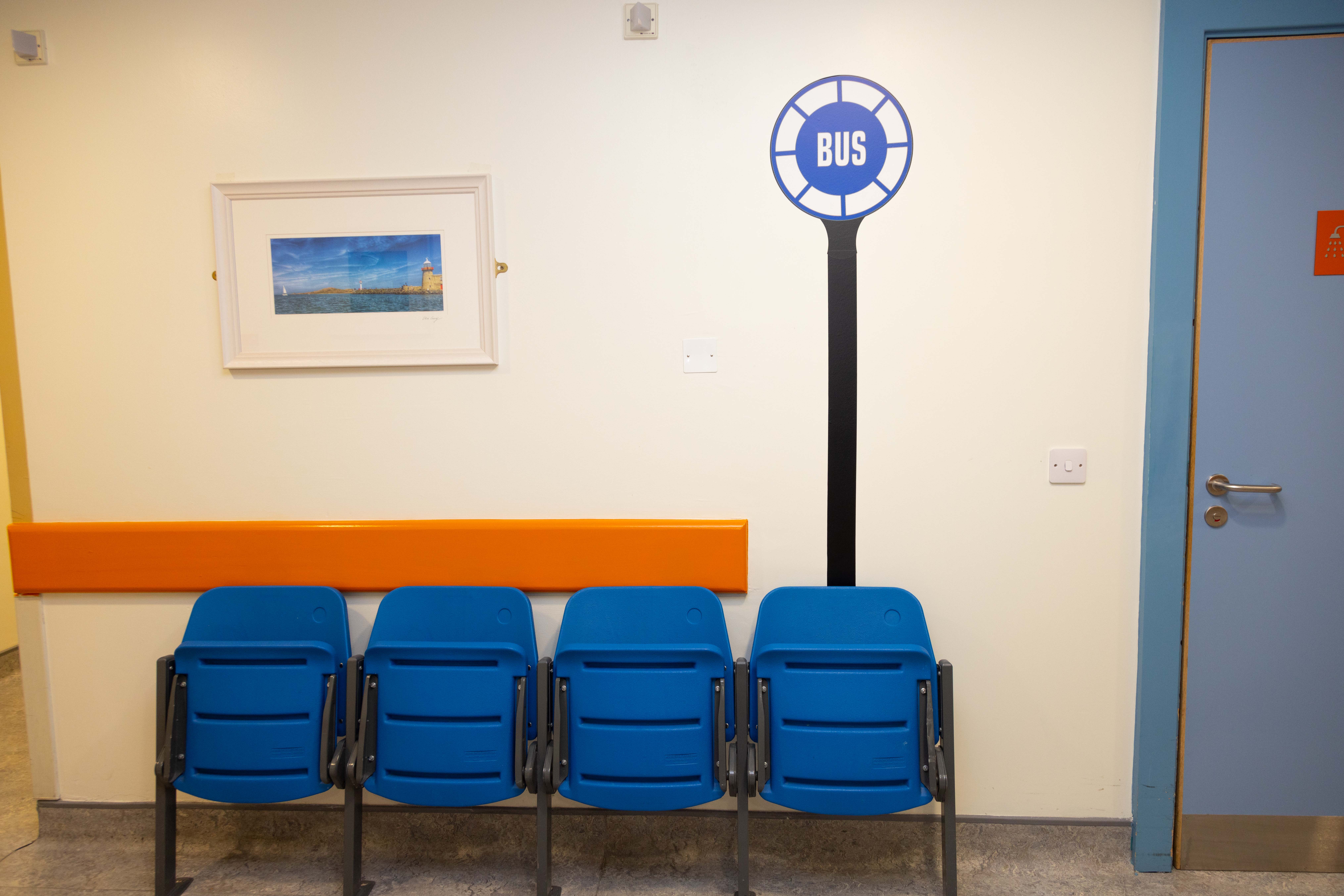
- Renovation of the family room to create a homely, familiar feeling sitting room where patients can retreat to if agitated or distressed
- Reduced visual noise in the corridors
- Guiding lines of sight, peaking interest in the desired direction
- Simple use of colour, for example painting the exit door white to help it blend in and reducing the urge to leave the wards
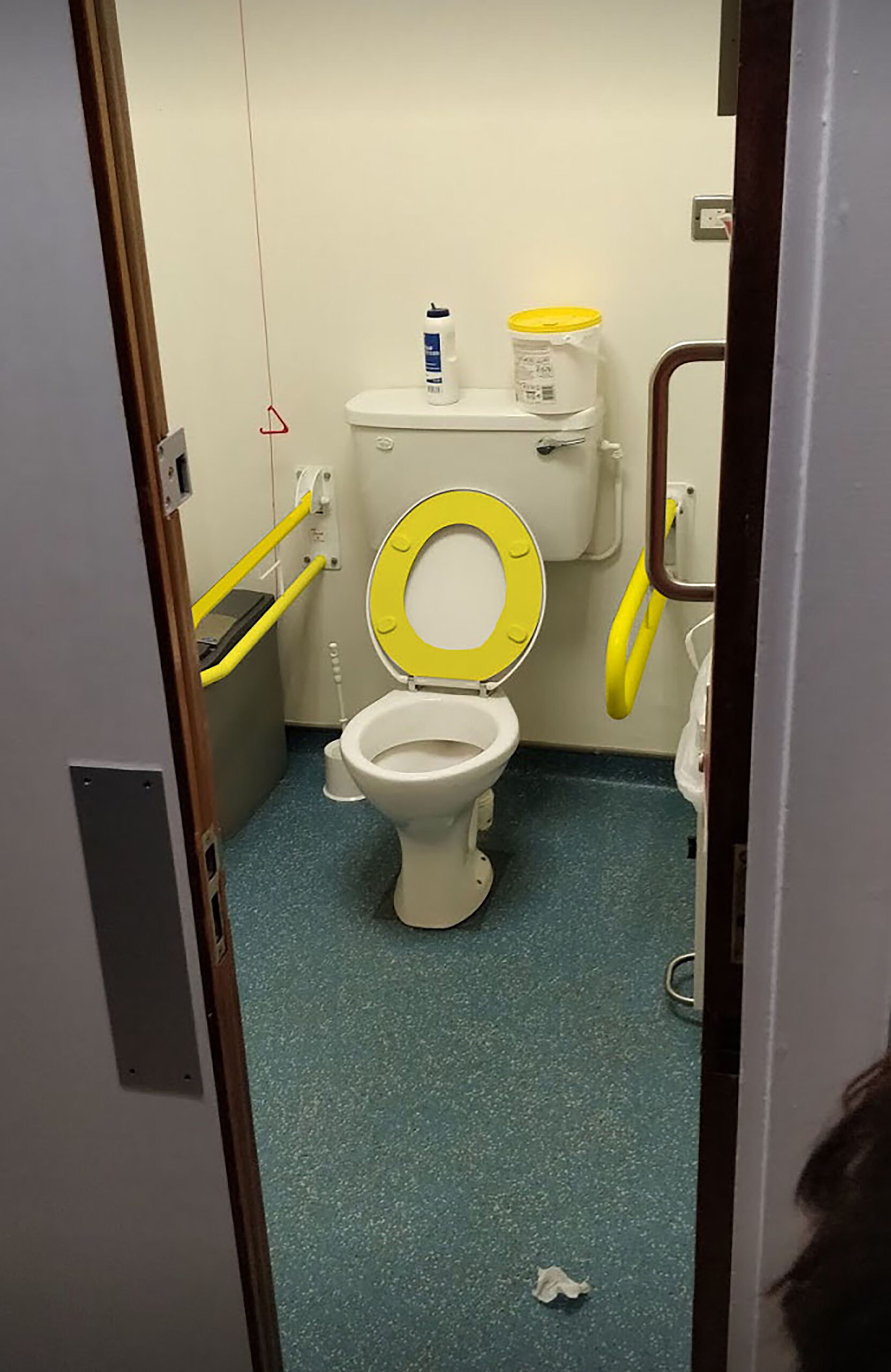
- Use of contrasting colours to help with spatial recognition in the toilets, at doorways
- Consistency in the flooring to prevent distraction and confusion when crossing thresholds


